
People decide in about a second whether to stop on your post. Design is what earns that second. These are the nine rules I use for client posts, whether I design in Photoshop, Illustrator or Canva.
Rule 1: Use the right size and keep a safe zone
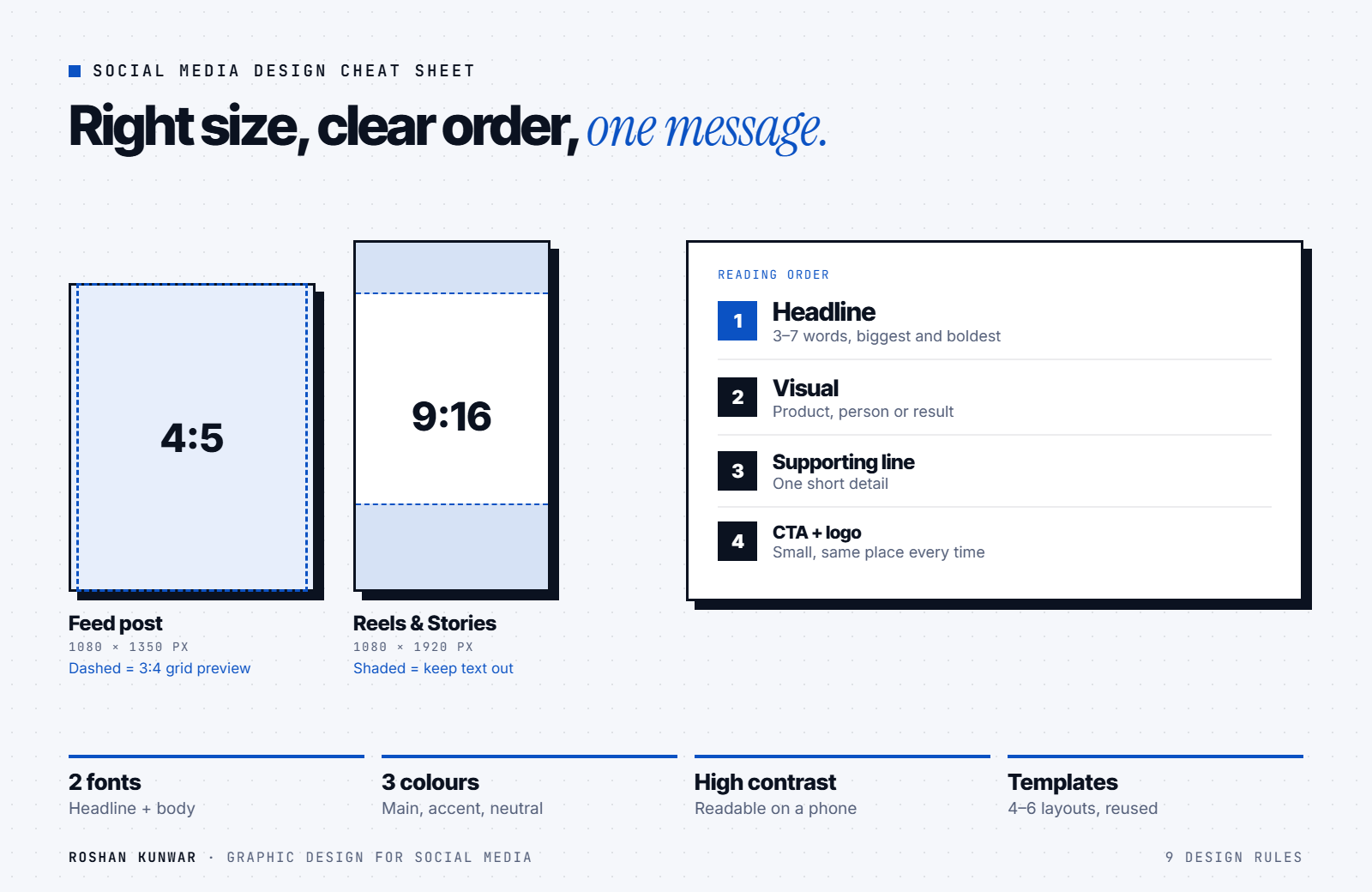
- Feed posts: 1080 × 1350 px (4:5) takes the most space in the feed.
- Reels and Stories: 1080 × 1920 px (9:16). Keep text away from the top and bottom, where the app places buttons and captions.
- Profile grid: Instagram's grid preview is now taller than a square, so keep key text and faces in the centre of the design.
Rule 2: One post, one message
If a post says five things, people remember none. Pick a single message and cut everything else. Put details in the caption, not on the image.
Rule 3: Build a clear hierarchy
The eye should move in this order:
- Headline — the biggest, boldest text (a benefit or hook)
- Visual — product, person or result
- Supporting line — one short detail
- Call to action and logo — small, consistent position
Rule 4: Make text readable on a phone
- Keep the headline short — ideally 3–7 words.
- Use high contrast: dark text on light backgrounds, or white text on dark.
- Never place text on a busy photo without a solid or blurred shape behind it.
- Check every design on your phone before posting.
Rule 5: Two fonts, used the same way every time
Choose one bold font for headlines and one simple font for body text. Use them on every post. For Nepali text, test that the Devanagari font renders correctly, because many free fonts do not support it well.
Rule 6: A small colour palette
Pick one main brand colour, one accent and one or two neutrals. Use the accent only for what matters — a price, a button, a key word. A consistent palette is what makes people recognise your posts before they read your name.
Rule 7: Leave space
White space makes a design look premium and easier to read. If a design feels crowded, remove an element rather than shrinking everything.
Rule 8: Use real photos and show the product
Real photos of your products, team and customers build more trust than stock images. Light them well — daylight near a window works — and keep the background clean. AI tools can help remove backgrounds or create product scenes, but the product itself must look exactly like what customers will receive.
Rule 9: Templates make you consistent
Create 4–6 templates — tip, product, review, offer, announcement and carousel — with fixed positions for logo, headline and call to action. Templates make your grid look planned and let you create a week of posts in an hour.
Quick checklist before you post
| Check | Yes / No |
|---|---|
| Right size (4:5 feed or 9:16 vertical) | |
| One clear message | |
| Headline readable on a phone | |
| Brand fonts and colours | |
| Logo in the usual position | |
| Clear call to action | |
| Spelling checked (English and Nepali) |
Design and marketing work together
A beautiful post with no strategy does not sell, and a smart strategy with weak design gets ignored. Pair these rules with a content plan — my 30-day social media strategy shows how — and test your best designs as ads using my Meta ads guide.
FAQ
What is the best Instagram post size in 2026?
For feed posts, 1080 × 1350 px (4:5). For Reels and Stories, 1080 × 1920 px (9:16). Keep important content in the centre so it is not cut off in the profile grid.
Is Canva good enough for professional social media design?
Yes, for most small businesses. What makes a design professional is the rules above — hierarchy, contrast, consistency — not the tool. For logos and full brand identities, a dedicated designer and tools like Illustrator are better.
How many fonts should a brand use?
Two: one for headlines and one for body text. Three at most, if you need a special accent font.
How do I make my posts look consistent?
Use templates with fixed layouts, the same two fonts and a small colour palette on every post.